Redesigning the registration journey for all the brands
Enhancing User Experience: Consolidating Design Systems and Tailoring User Journeys
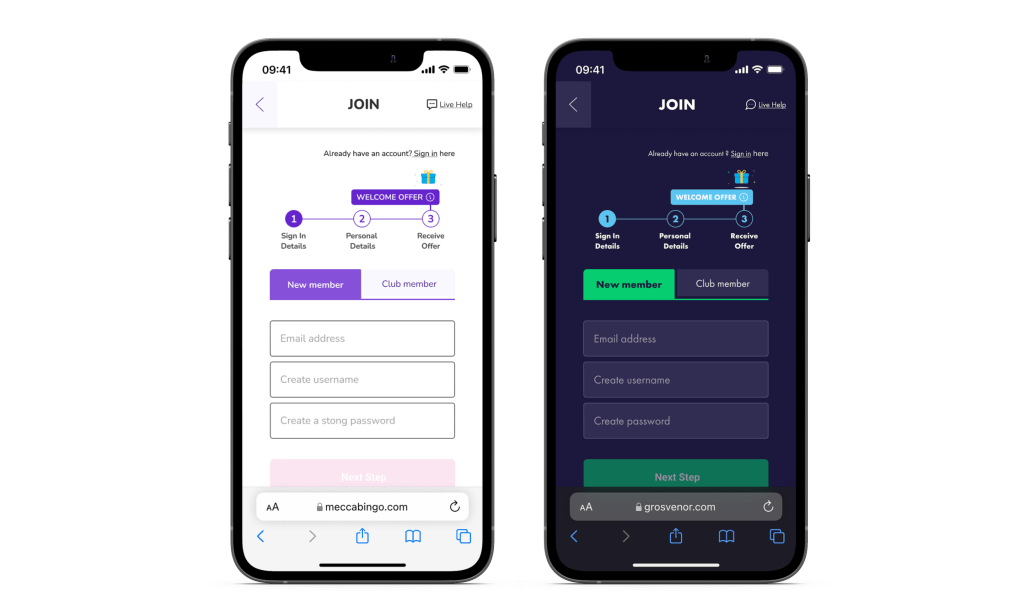
User journey redesigned for all brands
The aim was to smooth the current registration process, removing any friction, and to inject excitement to surprise and enhance the user experience. And as part of the design system convergence initiative (the merger of design systems for all brands) to create a single structure that can be utilised across all brands.
The project also required finding a way to segment our users, offering them a better-customised experience based on their preferred playing channel, whether they prefer playing online, at a venue, or both.
Timeline: 3 months
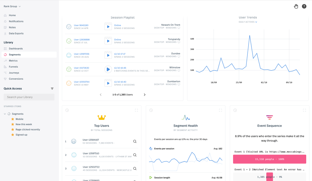
My role in the project entailed designing and optimising the registration process. I played a key role in identifying usability issues, proposing improvements, and implementing changes to enhance the user experience. Additionally, I conducted usability tests and gathered feedback to iterate and refine the final design.

First step
- Work with stakeholders & product managers to brainstorm and co-create ideas in the discovery phase.
- Collect and analyse diverse data types, incorporating both qualitative and quantitative insights. This entails conducting primary research and compiling secondary research such as competitor analysis and benchmarking.
After research – Lead meetings with stakeholders, product managers and technical lead to confirm project requirements
Requirements
Enhancement
By optimising the process to make it easier, smoother, and more efficient for users to sign up and increase the completion of the registration.
Encouragement
Attract and incentivise users to complete the registration process.
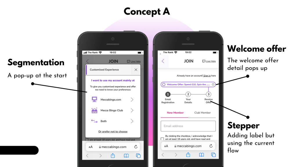
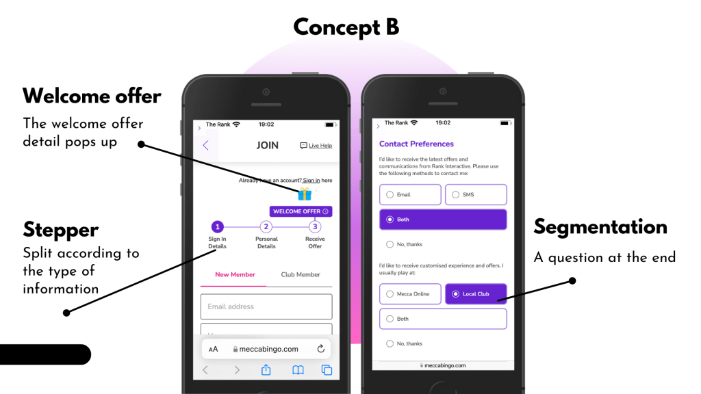
Segmentation
Explore methods for categorising users’ typical channel usage patterns during registration.
Consolidation
Ensure the registration process can be utilised across all our brands.
The Proposed Design Solution
Enhancement
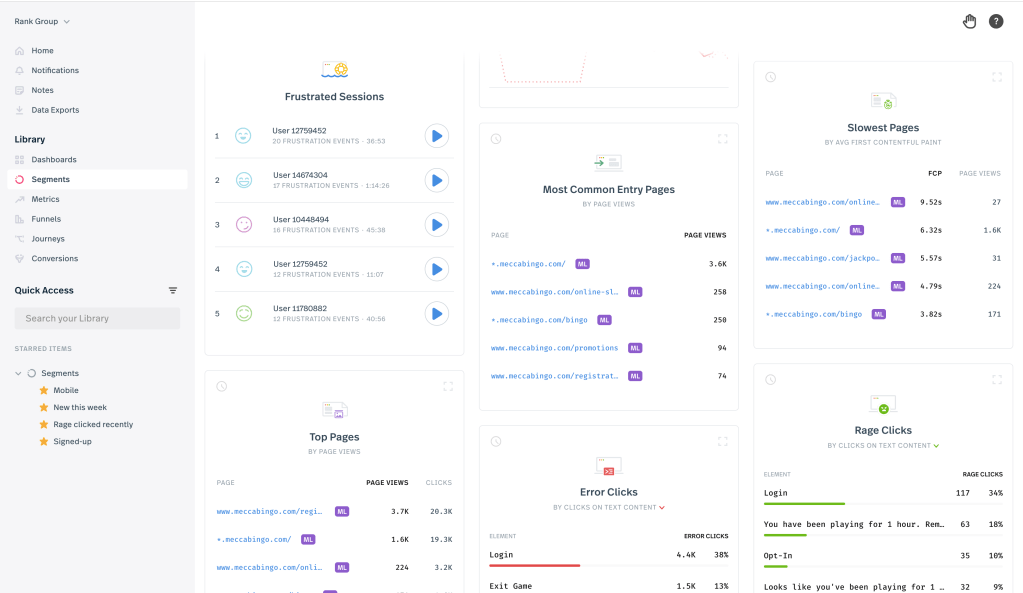
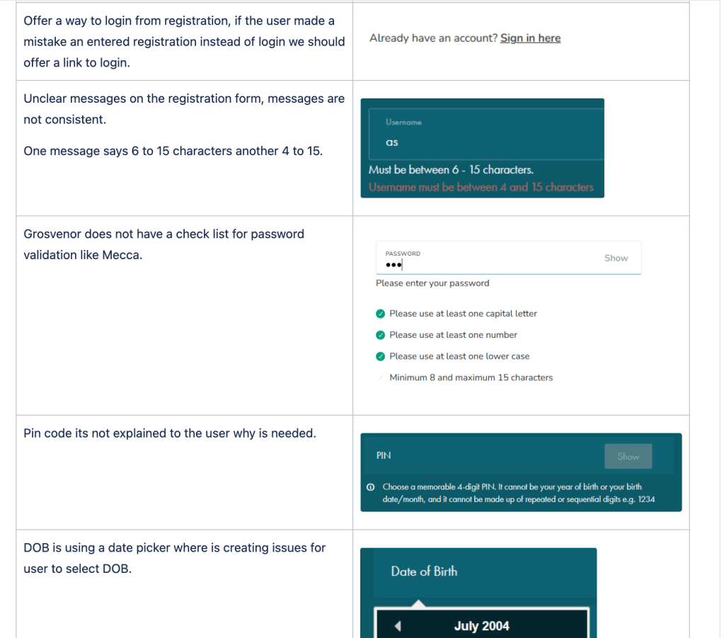
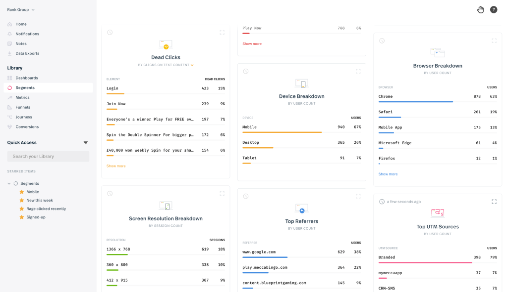
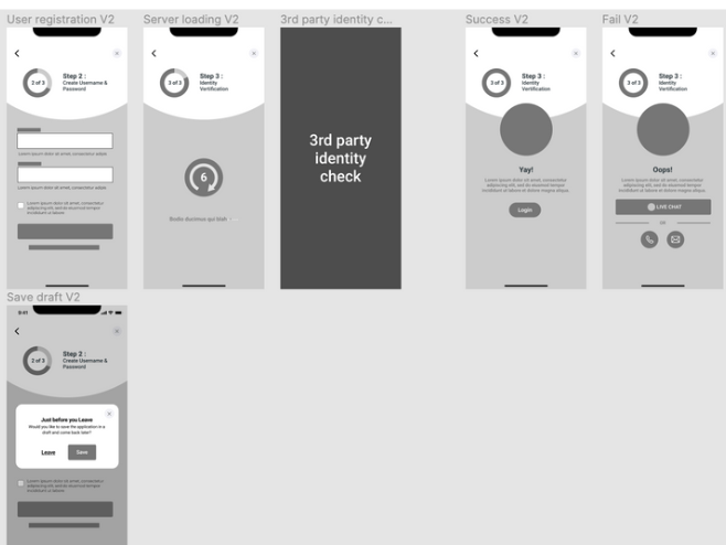
- We noticed users were skipping the terms and conditions checkbox and heading straight to the next step button using Fullstory. To address this, I suggested incorporating a design pattern which was responsive enabling to keep users focused on key interface elements.
- To enhance recognition, I also suggested adding labels on the steps of the progress tracker. This would excite users, indicating they’re close to the offer they’re signing up for, and provide clear indication of their current progress. Additionally, I rearranged the fields in a logical and intuitive order, grouping related fields together in one step to follow a natural flow for more organised navigation. This aims to address the usability issue observed and reduce cognitive load by applying the principle of proximity.

Encouragement
- By consistently showcasing the welcome offer and providing easy access to its details (e.g., via a pop-up) throughout the registration process, it encourages users to sign up and engage with the platform. This approach can boost user acquisition, retention, and overall engagement by emphasising the value they’ll receive upon registration.
Segmentation
- Stakeholders suggested an idea with a pop-up at the start, I took their advice into consideration but also suggested a less invasive concept, integrating the segmentation questions into the marketing preferences section.
Consolidation
- To develop a unified registration process that can be used across all brands, including those that are purely digital and those with an omni-channel presence.
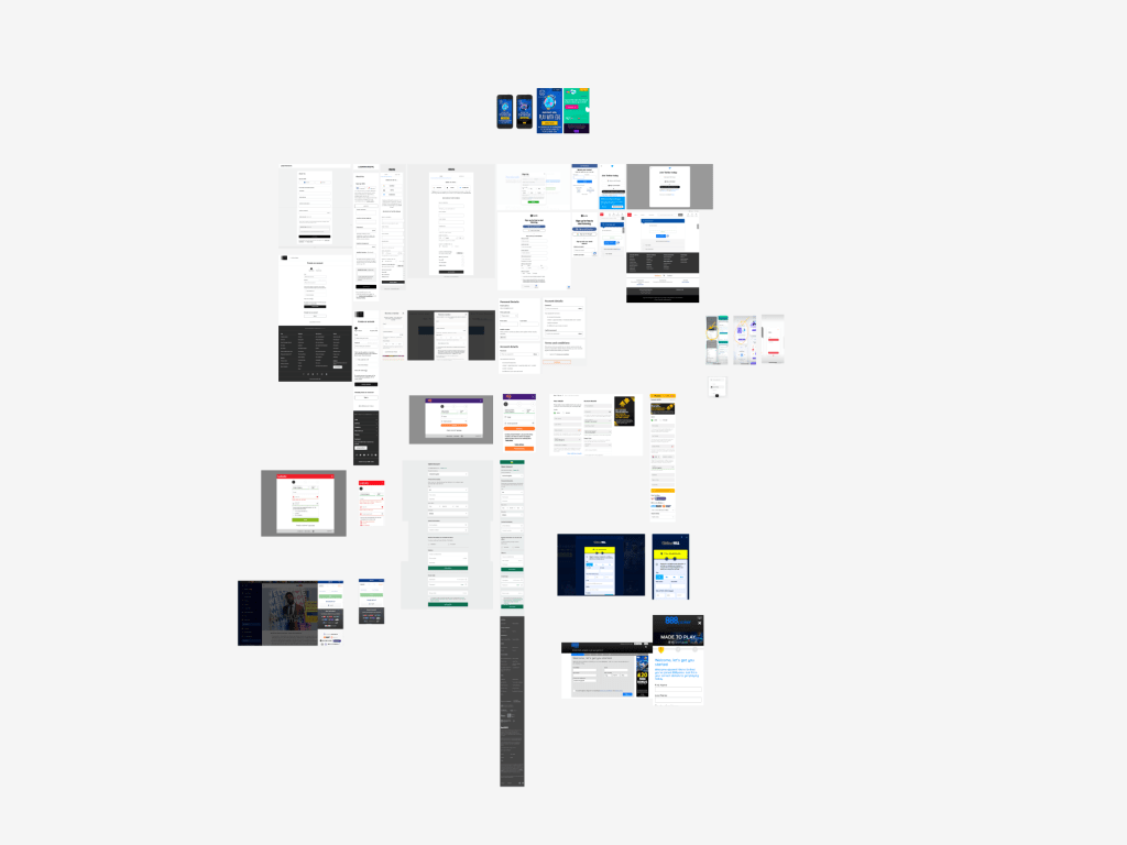
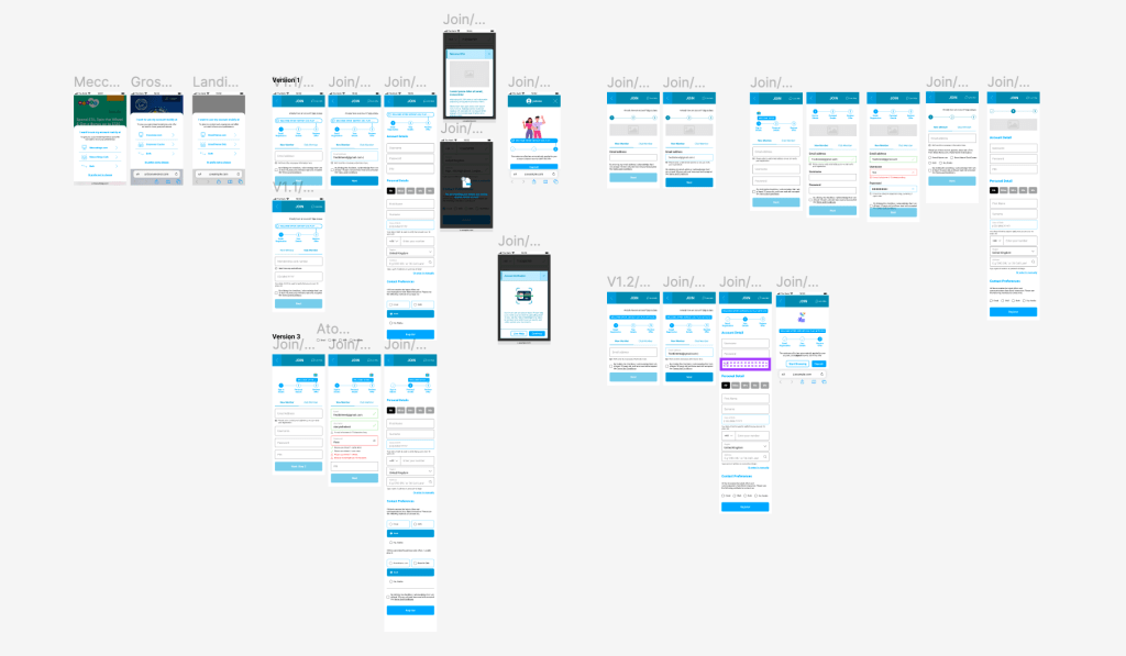
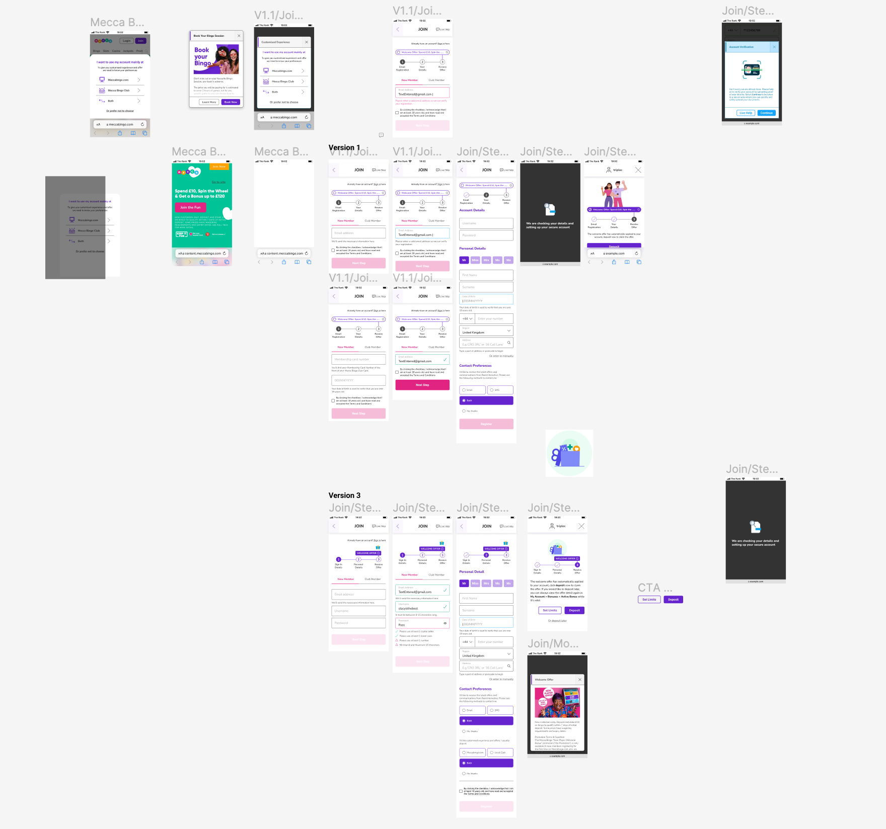
Design concepts development
- Create wireframes using Figma and devise three concepts for discussion with the product manager, technical lead and stakeholders at the initial stage.
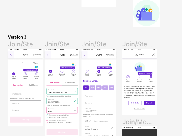
- Select two out of the three concepts and incorporate brand guidelines to refine the designs to pixel perfection.
- Export the designs into Axure to produce high-fidelity prototypes, then conduct usability testing to validate and inform design decisions for stakeholders.

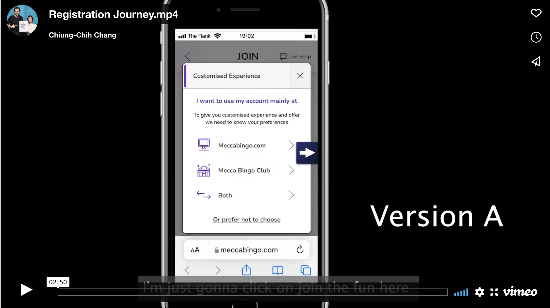
User Testing

After testing – Conduct a presentation to share the results of the testing and communicate design decisions to stakeholders and the relevant team. Iterate on the designs based on their feedback.
Findings
Enhancement
The enhancements I proposed have tackled the usability issues we observed previously in Fullstory.
“B just had more flow, made me feel better and more excited. Was super clear and much more invigorating than A.”
User A
Encouragement
The majority of participants clicked on the welcome offer pop-up on both versions without prompting. The participants in the usability test especially mentioned the Lottie animation in version B and gave positive feedback compared to version A that is a static banner notification.
“I found version B easier to visualise where I was in the sign up process due to the welcome offer animation.”
User B
Segmentation
The majority of participants favoured version B over version A for segmentation, as they found the signup journey to be unexpected or misunderstood that they were being prompted to sign up with two different channels when the pop-up was placed at the start.
“It was less invasive compare with the initial pop-up. It also grouped all sign-up information together effectively e.g. password, email address and username.”
User C
Consolidation
As we used components from the consolidation project, our unified design system can easily accommodate all other brands without the need for extensive redesign. We used the flagship brand, Mecca Bingo, to build the foundation for the process and as the trial for user testing.

Final step
- Review the final design with business analysts before passing it on to the development team. This ensures that solutions are thoroughly assessed to guarantee alignment with business objectives and requirements.
- Deliver a comprehensive handover to the development teams, ensuring they possess all necessary resources to effectively implement the designs.
- Offer continuous support to the development process by attending refinement sessions and conducting regular design review checkpoints. This ensures adherence to quality standards and specifications as intended.

Product Demo
Learning
Looking back at our project, I’ve realised how crucial it is to manage the project’s scope effectively. Understanding the project’s goals and requirements thoroughly is essential for successful scope management. Creating a detailed scope statement helped to clearly outline what needed to be done, along with any limitations and assumptions. Keeping a close eye on the project’s progress and making sure it stayed on track prevented any unnecessary changes creeping in, which could have derailed the project. Moving forward, I’m committed to applying these lessons, knowing that careful scope management not only keeps things running smoothly but also ensures everyone stays on the same page.
